PUBLISHED IN
Mar 27, 2020 Category:
Uncategorized
Mar 27, 2020 Category:
Uncategorized
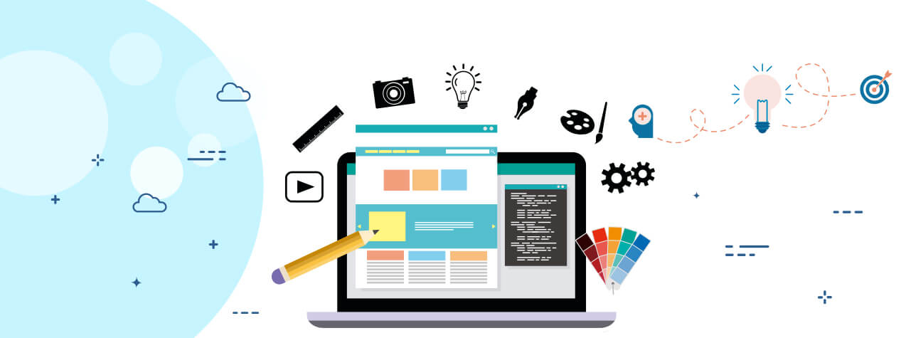
So, you’re going to have your own website, that’s awesome!
A website represents your business and ensures your online presence allows you to market your service offerings on digital platform. Also does it add credibility to your business. According to a research, six out of 10 customers expect the brands to own websites and look for them online. Searching for anything on Google has become a part of our reflexes, as the moment we come to know of anything, we grab our phones the very next moment to learn about them online.
Even if you don’t own a website and have started thinking of having one, pat your back and go ahead!
But just having a website is not all. If you are looking to build a website, make sure it complies with the ongoing trends and modern website designs, so that you catch more attention. Of course, that’s the designer’s part, yet you need to awaken the trendy you by updating yourself about the ‘what’s hot’ and ‘what’s not’ in the scene!
Know about: How Far Does Website Design Matter
The digital scenario keeps changing rapidly and that requires you to keep yourself in pace with them. New trends keep popping up time to time; some are short-lived, while some stay. Minimalism is one such trend that’s here to stay.
Gone are the days when entire garden represented the Spring season’s floral bloom. Today even a tiny bud that is about to blossom can represent spring and develop in you the same amount of emotions. Yes, minimalism is in the digital designers’ palettes and is dominating the website design.
A minimalist design is about ‘simplifying’ by removing the elements that are not required. But that does not minimize the impact. In fact, that rather does more.
Minimalism though may not require you to design much owing to the minimum elements required, yet implementing the same may be a challenge. There are various tips which you can implement minimalism with.
The designer’s term refers to the white space between elements in a picture. White color is the balancing factor in a composition that makes you stay there a little longer. It not only gets more concentration but also improves user experience.

Bright colors and Minimalism may not sound to be the components of the same plate, yet can be integrated together, in a tricky way though. Such colors certainly catch the gaze but overdoing them may bug the viewer. So bright colors blended with soothing tones may wave the magic wand on entire composition.
Fonts can make or break the entire composition!
A great font in harmony with the minimalist design can do wonders for the composition. The fonts created especially for the purpose are Gidole Open Source Modern DIN, Relica Trio, Less Sans Minimal Typeface, Bw Glenn Sans Font Family, Latina Essential Font, Bergen Text, Virtuous Slab Font, Enrique Sans Serif Font Family, Giraffey Free Font, Chromoxome Pro Typeface, Follana Font, Bold Sans are some of the most promising fonts available on the Internet.
These fonts do not just make you read through the design text, but also help you conceive the message with an impact. Many websites have used these fonts in their homepage beautifully enough to capture instant attention. You can play with the size of these fonts to strengthen the impact.

Realizing the fact that the text content presented in blocks helps the content get perceived better and effortlessly, text blocks are considered to be included in the design. Apart from this, they lighten up the burden of holding text for the entire web page.
Text boxes organize the textual content and make them presentable unlike the scattered content.
Minimalism in website design involves minimizing all that can be. But sometimes designers overdo it by removing even the navigational access to the website, leading to navigational issues and finally the abandonment of the website despite all the creative efforts. So, designers need to be mindful about implementing minimalism leaving at least the Menu.
The best way to minimize the elements on a Home Page is embedding the extra buttons into major ones like – Menu, the logo itself, and the design elements that are highlighted just to indicate they are clickable.
The images in a website should be able to send a vibe to the users such that they connect with the website instantly. The magic created by high definition (HD) images plays a lead role in this. However, they should not be placed just for the beauty sake, and should rather be related to what the website is all about.

Minimalism refers to all those petite details that grab immediate attention of the visitor. They may or may not be functional, yet lay bigger impact. These can be anything, showing up as anything like confetti, geometrical shapes, a bird or even a kite. It takes a while for the user to stop and see where that tiny Kingfisher is poking its beak in!
You can expect anything in a minimalist design as every element is used or presented in an unexpected way, even with cursors and mouseovers that mostly are overseen. The cursor or mouseover effect enhance the user’s interest in the website manifold as even the movement of the mouse becomes too amusing for the them to leave.
The cursor should be designed such that it complements with rest of the website. However, some of the creative souls do just opposite and that makes this feature an absolutely a unique one for the user to experience.
Everything is fair in Creativity & Minimalism!
Know about 8 Tips for Web Design That Drive Sale
On a Minimal Note…
Minimalism is great, but should not be traded with the theme of the website and of course, the message to be conveyed. It should engage the audience in harmony along with serving purpose of the website.
Willing to go minimal with your website style? We are here to minimize your worries with our minimalistic designs that we will create for you!